Top 5 Animation Libraries
1-React-Motion-
React Motion is a popular library for animations in React. It makes use of physics to create animations that feel natural. All we have to do to create realistic animations is provide values for stiffness and damping and React Motion takes care of the rest.
Installation
Just add the react-motion package to your project using npm or Yarn. Here we’ll also make use of styled-component, so we’ll add that too:
Setup
To create a simple demo, our App component will just render two Card components:
App.js
Card.js
Our cards look like this:
2-React-Spring-
react-spring is a spring-physics based animation library that should cover most of your UI related animation needs. It gives you tools flexible enough to confidently cast your ideas into moving interfaces.
This library represents a modern approach to animation. It inherits animated's powerful interpolations and performance, as well as react-motion's ease of use. But while animated is mostly imperative and react-motion mostly declarative, react-spring bridges both. You will be surprised how easy static data is cast into motion with small, explicit utility functions that don't necessarily affect how you form your views.
Installation
npm install react-spring
3-React-reveal-
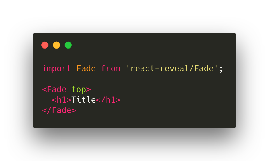
React Reveal is an animation framework for React. It has basic animations such as fade, flip, zoom, rotate and a lot of more advanced animations. It allows you to control all animations with props, for example: the position, delay, distance, cascade and many others. You can also use the custom css effects. Also it has server side rendering and high order components. If you prefer to use animation on scroll this framework for you. Check out how it works.
4-React Anime-
the library is built on all animations with animate.css. It is easy to use and has a lot of animation collections. React-animation works with any inline style library that supports the use of objects to define keyframe animations, such as Radium, Aphrodite or styled-components. I prefer to use the styled-components. 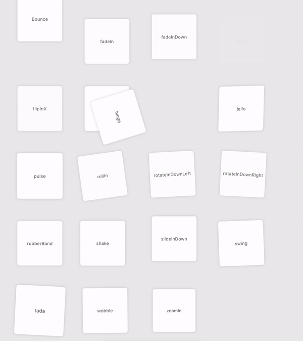
5- Framer Motion -
Framer provides helpers for advanced physics-based animation, complex touch-based gestures and common components for scrolling, paging and interface flows. It’s designed to allow beginners to explore digital product ideas without boundaries.
Installation -
npm install framer
Importing -
import { Frame } from "framer";
Animate Example in Framer-
Index.js
import * as React from "react";
import { render } from "react-dom";
import { Frame } from "framer";
import "./styles.css";
export function MyComponent() {
return (
<Frame
animate={{ rotate: 360 }}
transition={{ duration: 1 }}
size={150}
background={"#fff"}
radius={30}
/>
);
}
const rootElement = document.getElementById("root");
render(<MyComponent />, rootElement);
Style.css
body {
margin: 0;
padding: 0;
}
#root {
font-family: sans-serif;
text-align: center;
width: 100vw;
height: 100vh;
display: flex;
place-content: center;
place-items: center;
background: rgba(0, 85, 255, 1);
margin: 0;
padding: 0;
perspective: 1000px;
}


No comments:
Post a Comment
Feel free to ask me for any query regarding my post