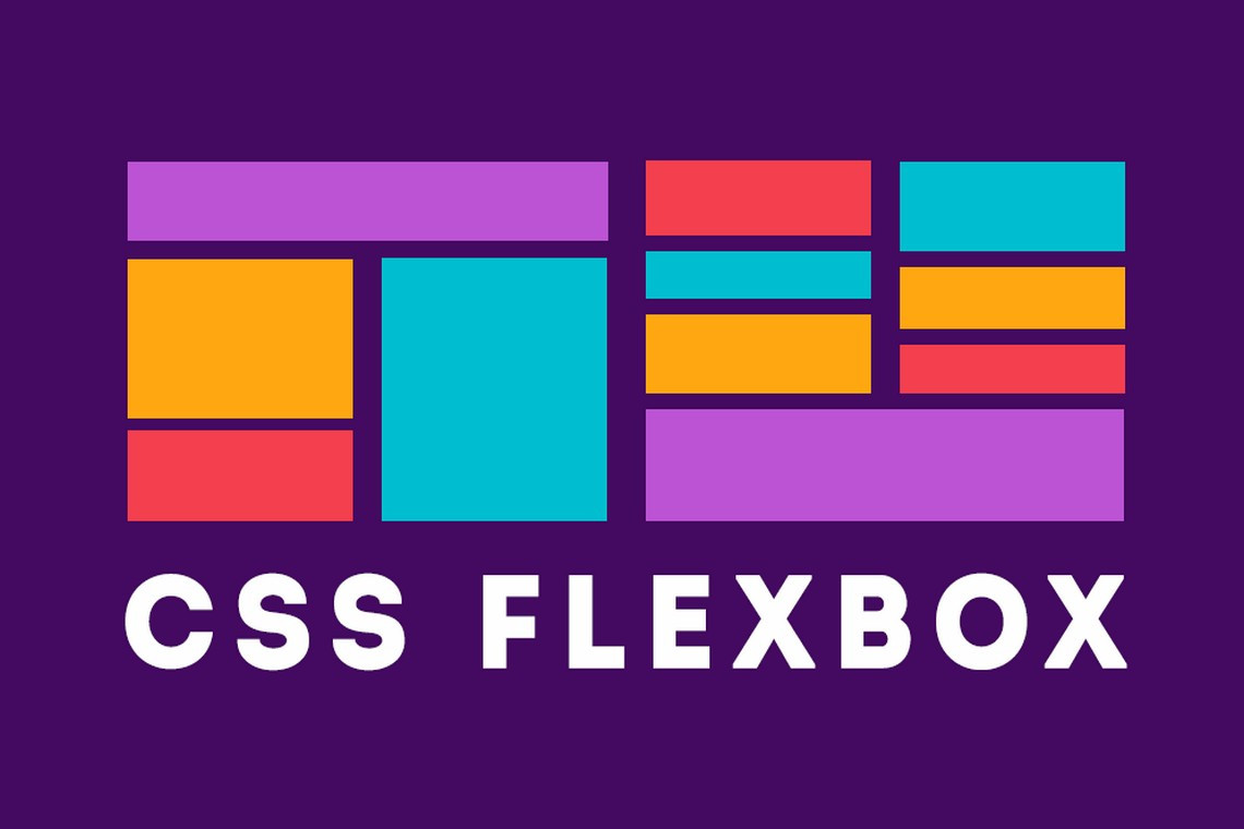
Do you know CSS Flexbox?
CSS Flexible Box Layout, commonly known as Flexbox, is a CSS 3 web layout model. It is in the W3C's candidate recommendation stage. The flex layout allows responsive elements within a container to be automatically arranged depending upon screen size.
Properties for the Parent
display-
This defines a flex container; inline or block depending on the given value. It enables a flex context for all its direct children.
.container { display: flex; /* or inline-flex */ }
flex-direction
This establishes the main-axis, thus defining the direction flex items are placed in the flex container. Flexbox is (aside from optional wrapping) a single-direction layout concept. Think of flex items as primarily laying out either in horizontal rows or vertical columns.

row(default): left to right inltr; right to left inrtlrow-reverse: right to left inltr; left to right inrtlcolumn: same asrowbut top to bottomcolumn-reverse: same asrow-reversebut bottom to top
justify-content
flex-start(default): items are packed toward the start of the flex-direction.flex-end: items are packed toward the end of the flex-direction.start: items are packed toward the start of thewriting-modedirection.end: items are packed toward the end of thewriting-modedirection.left: items are packed toward left edge of the container, unless that doesn’t make sense with theflex-direction, then it behaves likestart.right: items are packed toward right edge of the container, unless that doesn’t make sense with theflex-direction, then it behaves likestart.center: items are centered along the linespace-between: items are evenly distributed in the line; first item is on the start line, last item on the end linespace-around: items are evenly distributed in the line with equal space around them. Note that visually the spaces aren’t equal, since all the items have equal space on both sides. The first item will have one unit of space against the container edge, but two units of space between the next item because that next item has its own spacing that applies.space-evenly: items are distributed so that the spacing between any two items (and the space to the edges) is equal.
CSS Flexbox have much more...


No comments:
Post a Comment
Feel free to ask me for any query regarding my post